The Grit and the Grain: A Study in Punk-Infused Pub Branding
In a city defined by its centuries-old architecture and modern nightlife, a promotional flyer must bridge the gap between “historical” and “happening.” The poster for this London Pub Crawl achieves this through a high-contrast, “analog-digital” fusion. By utilizing a “photocopy-style” aesthetic, the design suggests an event that is gritty, authentic, and undeniably London.
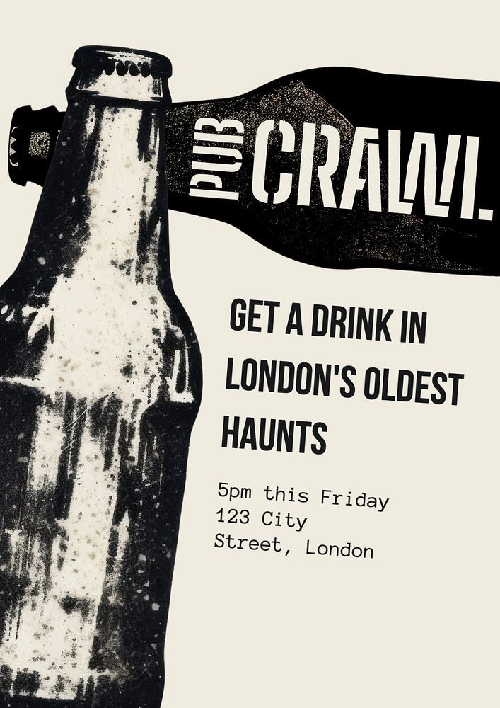
The “Zine” Aesthetic and Visual Impact
The defining feature of the poster is its high-contrast, monochromatic photography.
- The Beer Bottle: Rather than a polished, colorful product shot, the central beer bottle is rendered in a “dirty” grayscale that mimics the look of a 1970s punk fanzine. The “distressed” texture—complete with white specks and irregular edges—evokes the feeling of a street-pasted flyer, creating an immediate sense of “underground” credibility.
- Asymmetrical Silhouettes: The horizontal bottle overlapping the vertical one creates a dynamic “T-shape” that breaks the frame. This unconventional composition draws the eye directly to the event title, “PUB CRAWL,” ensuring the primary message is unavoidable.
Typographic Hierarchy and “Street” Cred
The design utilizes three distinct font styles to create a clear informational flow:
- The Masthead: “PUB CRAWL” is rendered in a custom, blocky sans-serif that looks like it was cut from paper or stamped. The use of all-caps and heavy weights signals a loud, high-energy environment.
- The Punchline: “GET A DRINK IN LONDON’S OLDEST HAUNTS” uses a cleaner, condensed sans-serif. This font acts as the “sophisticated bridge,” connecting the raw imagery of the bottle with the historical promise of the text.
- The Logistics: The specific event details (5pm this Friday, 123 City Street, London) are set in a monospaced typewriter font. This is a classic “low-fi” design choice that reinforces the “hand-made” feel of the poster, suggesting a local, grassroots event rather than a corporate tour.
The Narrative of the “Oldest Haunt”
The tagline—”London’s Oldest Haunts”—is a clever piece of dual-meaning copywriting. It highlights the city’s rich pub history while playing on the spooky, atmospheric connotations of the word “haunt.” This positioning appeals to both the history buff looking for a traditional pint and the social seeker looking for a unique nighttime adventure.
Conclusion: The “Underground” Call to Action
This poster proves that minimalism does not mean a lack of character. By stripping away color tailgaterstavern.com and focusing on texture, the London Pub Crawl design creates a “vibe” that is cool, unpretentious, and deeply rooted in the city’s DIY culture. It is a design that doesn’t just inform the viewer; it invites them into a specific, atmospheric experience.
Leave a Reply